Sunday, March 2, 2014

Faculty Art Show

Drum roll puuuulease! I have submitted two pieces to the Faculty Art Show. Nothing to do now, but wait.....


Title: WALL FLOWER - Digitally Manipulated Original Photography


Title: WEATHERED - Original Digital Photography


Tuesday, September 24, 2013

SUN Feel FUN Feel!

SunFeel


The Dieline discussion regarding OTVETDESIGN...

OTVETDESIGN has created developed a new package design for Sunfeel horticultural canned food.

"What differs vegetables grown in the sunlight from their fellow creatures pined in the stuffy glasshouses? Zest for life! They know what the real not the electric Sun is. Sunfeel™ selects natural fruit and vegetables from the very south where there are a lot of sunshine, day light and the good!

Therefore we decided to give the trade mark a bit ruffian-like but easy-natured character inherent by the fancy free fruit and vegetables only. In the label self-sufficient and self-confident children of nature are looking at us through the sunglasses. No additives and chemicals, but pure beauty and force of attraction. Every vegetable in a can is unique and has its own inimitable style. One would do well to learn from these guys.
The Dieline - TOP 10 POSTS OF THE WEEK!

Top 10 Posts

Thursday, October 4, 2012

Gotta LOVE Colorado!  LovelandAleWorks@thedieline


Design for an independent, family-owned brewery offering a selection of small batch handcrafted beers.

"Manual created a complete visual and verbal personality to reflect the owners’ passion for beer, while reflecting a little of the local history of Loveland as a gateway to Rocky Mountain National Park, and as a town founded with the inception of the Colorado Central Railroad. The identity takes cues from Loveland’s past as a railroad town, from the logo badge itself, to the custom-designed tap handles based on 19th century railway signal levers.

A central part of the identity is a custom-designed display typeface in two styles. A key focus of our design strategy was to marry the old with new, and bring style into the brewery tasting room experience. Manual worked closely with the client to develop the interior and exterior, exemplifying the brewery’s charm. We designed the interior to retain existing elements of the building, but offset it with a clean, contemporary feel.
 
Honest materials including raw plywood posters, letterpress coasters, local reclaimed wood furniture, and heavyweight iron-forged hanging sign give visitors an immediate impression of Loveland Aleworks’ passion for handmade craft."

Monday, April 2, 2012

Food Revolution

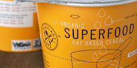
Simple, clean communicative graphics communicate the character of the product. What do you think about this design?


Monday, March 26, 2012